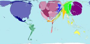
WorldMapper – A different view of our world
Ciaran Moore - February 28, 2007 This is a cool website that shows many statistics about the world. But the interesting thing is the way it does it.
The goal of this project is to use the map projections known as cartograms to depict comparisons and relations between different areas of the world. Effectively showing a graphical representation of various worldwide statistics such as population, production, health, pollution, etc.
As of me writing this, the site has 294 maps in total on various statistics. Its an interesting way of viewing various aspects of our world as it resizes the world map view to reflect the various statistics, this is much easier to understand by looking at the website, so go check it out.
This entry was posted on Wednesday, February 28th, 2007 at 3:35 am and is filed under Design, Developer, Fun, Internet, Main, Web services. You can follow any responses to this entry through the RSS 2.0 feed. You can leave a response, or trackback from your own site.


September 22nd, 2007 at 4:24 am
Good site!
October 29th, 2007 at 5:12 am
Very iilustrative and clear. Nice that they have worked out such project.